By Lauren Riddiough Clement, Owner/Decorator of Lauren Nicole Designs and Lila HOME
So much of what we see today in home decor magazines and online resources, such as Houzz and Pinterest is neutral, neutral, neutral. Neutral furniture, neutral fabrics and neutral walls. And while neutral can be gorgeous, it may not be for everyone and every room.
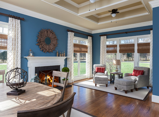
Here is one of my latest rooms that I am just in love with that shows off bold and beautiful wall color.
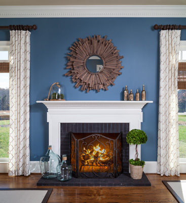
Because the wall color makes such a statement, I kept the furnishings of the space fairly neutral and concentrated on textures. The draperies are a light linen blend with a diamond shaped embroidery and I just love how they contrast the wall color. Also, notice how we painted the ceiling instead of leaving it white so that it was a warm blend with the walls and no too stark. The walls are Benjamin Moore HC-159 Philipsburg Blue and the ceiling is Benjamin Moore HC-35 Powell Buff. This mirror is definitely one of my all time favorites!
Because this room is very rectangular, with a fireplace smack in the middle and doors leading out to a patio on the left, furniture placement required a precise plan. My client wanted a place to retreat to and read or relax in the abundant sunlight as well as a place to have family game night or a casual meal with friends. So we created two separate but coordinating spaces.
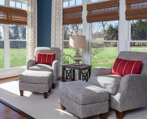
You can see that the color of these chairs is fairly quiet with a hint of the blue wall color accented with a bold red stripe pillow for a bit of fun. And the rug is a neutral sisal-like field with a leather border. The combination of all of these textures is a nice combination with the rich walls to allow them to stand out without feeling overwhelming.
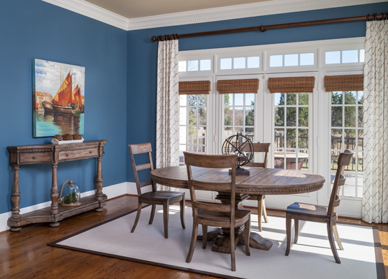
I love this medium color wood tone against the Philipsburg Blue. It is rich, rustic and handsome all at the same time. And the pop of color in the artwork keeps this side of the room from being too quiet.
While I do work with a lot of ‘exciting neutrals’ in the beige and grey families, it is so much fun to use a bold and beautiful color on the walls and to focus on the textures and patterns of all of the components in the space.
Do not be afraid to try this in a room in your home but think about the other rooms that it connects with. For example, some family rooms connect to the foyer and hallways and that would make it difficult to use a splash of color as it is not a contained space. Consider powder rooms, dining rooms or conservatories like this one, to go bold on the walls.
Happy painting!


